[ISF][MICHAEL TLV]
ISF/M-TLV Calibration Report Version 2.0
Something New, Something Old
The Art of Presenting Grayscale Calibration Work To The Public
<< Back to Calibrators
Page 1
| Page 2
So the big question is, how do we present
the public with something that is more informative and gives a better representation of
the actual grayscale calibration process and yet does not make them roll their eyes in
confusion. There must be some way to properly quantify how much better the grayscale
tracking is after the calibration process. Presenting the client with a graph like
in Sample #2 is undesirable and has the potential to send the wrong message. It
ultimately tells the client little to nothing in terms of pre-calibration and post
calibration. (Although in the end, we all let our eyes be the judge of how good or
bad things really are and someone passing off that green Furry Pig as being a properly
calibrated image would never get away with it regardless of how the numbers read. This is
a good thing. =)
The quest is to find a better way of expressing the way the TV was before and after a
calibration session when it comes to grayscale tracking while keeping it simple enough for
people (re: enthusiast) to understand. Enter the following spreadsheet chart.
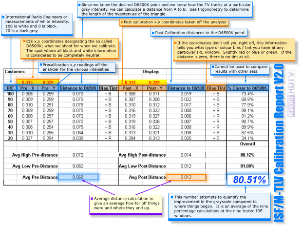
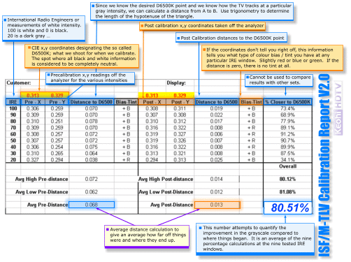
The ISF/M-TLV Calibration Report Version 2.0
Click on image to enlarge
|
Although this is nowhere near as
colourful as the typical grayscale tracking chart found in magazines, it is easy to use
and far more accurate in terms of telling the client just how different his
pre-calibration grayscale was compared to the post calibration grayscale. (Actually, most magazines present the graphs in
black and white so there are no colours to speak of anyway.) It provides a much better view of just how good or
bad a client’s grayscale tracking was. The
sheet still provides information at each light intensity tested, (IRE window box patterns)
just like the graphs, but instead of the colour temperature reading, we get X and Y
coordinates in what is known as colour space. This is how we actually do it as opposed to
looking for that 6500K colour temperature.
Scattergraph
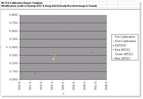 |
..
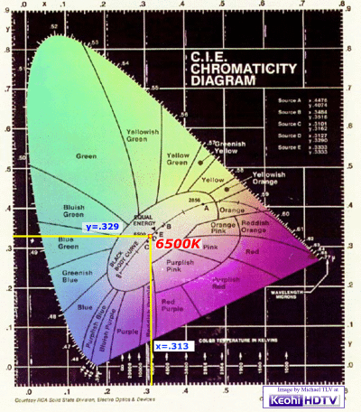
D6500K on the CIE Chart
Click on image to enlarge
|
|
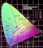
A quick and simple explanation of the CIE chromaticity
chart is that it represents all the colours that the human eye can pretty much see. Our eyes can see many more colours than what a TV
is capable of producing though or even what a magazine is capable of printing. There is a specific point on this chart that
represents what neutral colour information is, a point where black and white information
is considered to be absolutely neutral. (not
tinted blue or green or red.) This point on
the graph is denoted by the coordinates X=0.313, Y=0.329.
You do not have to burn these numbers into your head. Just know that they represent the D6500K point
that we strive to achieve.
The only thing the end user needs to be aware of
on the chart is the last column of numbers. The
percentages are nice and easy to understand. The
big “93.9%” figure tells the client how much more accurate his grayscale
tracking is compared to when you started. It
much better quantifies the work that you do for the client.
The more whacked out the TV is compared to the post calibration state, the
better the overall percentage number. The
lower the percentage number, the closer the TV was to being accurate. So if the overall improvement is 10% … you
know the set was pretty accurate to begin with (or the calibrator is terribly incompetent
or there is a major problem with the TV. ) The
calibrator is still expected to get the grayscale as good as possible.
I encountered a 1997 Sony 61” XBR RPTV
recently and the set tracked grayscale fairly poorly and it was near impossible to even
get something close to correct. The end
result showed an improvement of 34% compared to the pre-calibration result so low numbers
do not have to imply that the TV was more accurate.
The
final percentage numbers cannot be used to compare grayscale tracking between two
different TV’s though. The numbers are
only relevant for the display that the values were taken from. A 95% improvement on one display is not
necessarily better than a 50% improvement on a second unit.
The sheet does, however, present a set of numbers than can be compared to other
TV’s. The directly comparable numbers
are the “Distance to D6500” values. If
my pre-calibration totals are less then yours, then my set was closer to optimal at the
start. If my post calibration totals are more
than yours, then my set tracks worse than yours … regardless of the percent
improvement figure. Although not normally
used by the client, the information is still presented.
This actually permits two separate people to compare notes … if the same
calibrator worked on both their TVs.
The Bias-Tint column can be used by the client to
judge the imperfections of the grayscale in the display.
At any of the tested IRE windows, this box tells them exactly what type of
slight tint they may be seeing. At the low
IRE windows, it is better to have the tint be blue than green, but if the improvement is
really close, then do not worry about it. Let
your eyes be the final judge.
This article is not about teaching people to
properly calibrate the grayscale on the TV. It
is about presenting the information to the client in a more meaningful manner and yet not
totally confusing the client. While
presenting much more information than the client needs, the tale of the tape is in the
final column.
The breakdown of the sheet is also provided
with all the graphics design work credited to Errol.
The spreadsheet also includes a number of comments about the various columns in
terms of what I am trying to achieve.
I have made a copy of the spreadsheet available
for download at this site for those people / calibrators curious to try this manner of
presentation out. You can also e-mail me directly and I will send you a free copy.
I will be testing out this output format for my
clients over the next few months. This form
also has potential to be used in conjunction with the standard ISF report format. It merely replaces the graph on the report. Unfortunately, the formulas that are part of the
spread sheet require that values be entered into a spreadsheet first.
Page 1 | Page 2
|