[ISF][MICHAEL TLV]
ISF/M-TLV Calibration Report Version 3.0
Something New, Something Old
The Art of Presenting Grayscale Calibration Work To The Public
<< Back to Calibrators
Page 1 | Page
2
(June 9, 2003)
Greetings
What are the changes that were incorporated into the report since the last revision
2.0?
- The Chromaticity Triangle is now clearly shown on the scatter graph.
The points within the triangle are all the colours that the NTSC television system can
display. This makes it easier to describe to the client about the coordinate limits.
- A small circle called “Close”
has been incorporated into the graph. It roughly shows anyone looking at
the graph the visual significance of the calibration work. It is a compromise and a
simplification that gives the user a rough idea about their grayscale accuracy. If the
pre-calibration readings are all located within this circled area in addition to the
post-calibration readings, then the likelihood of the client noticing any visual
difference is small. (i.e. Most people probably cannot tell the difference.)
If the pre-calibration readings are located outside of the circle, the before and after
differences in the grayscale should be obvious to most people. This is a simplification at
best because the human eye is actually more sensitive to changes in the grayscale at lower
light levels like the 20/30/40 IRE range compared to 90/100 IRE. The eye is also more
sensitive to certain colours like green and red hence the slight shift of the circle
toward the blue end. Much more blue is required in the grayscale before we can notice a
change. The actual shape of the perception range is more elliptical than the circle shown
on the scatter graph.
- The third change in the report is the addition of a “Weighted Average
Percentage.” This number tries to roughly account for the human eye’s
ability to see differences in the grayscale at varying light output levels. We can see the
greatest amount of change in the darkest patterns like the 20 or 30 ire patterns.
Likewise, when the light level increases to the 80 to 100 ire levels, the grayscale has to
be skewed a lot more before we can really see the difference. For example, a 10% increase
in green on the dark end is far objectionable that a 10% increase on the bright end.
Often, we may not even notice it. I have therefore given the values on the darker end a
higher “weighting” when calculating the overall improvement of the image in
terms of grayscale.
Regards
Michael TLV writes:
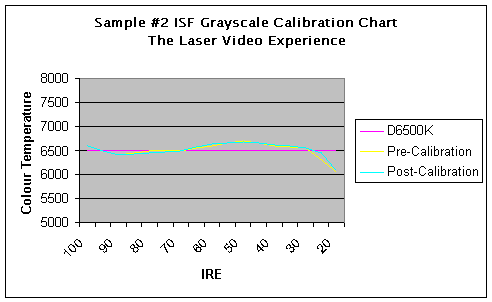
Up until now, magazines and other information sources on Grayscale
calibration presented results to a small, but curious public in the form of Grayscale
graphs charting the colour temperature versus various intensities of gray. A sample of such a chart is shown below. We see these in all the home theatre magazines and
some ISF calibrators provide their customers with something similar called the ISF
calibration report where the primary focus is on the big before versus after graph.

Now by itself, the graph is a nice visual
presentation of the TV’s grayscale tracking before calibration and after calibration. Now here comes the problem. The grayscale graph is a gross simplification of
the grayscale calibration process and the science behind what is being done. (Although
actually doing a grayscale is not that difficult with the proper tools.) It is presented in this graphical format because
it is feared that the public cannot grasp anything slightly more complex about grayscale
calibration and the basic theory behind it.
I bring this up because on not so rare occasions,
the information presented on the graph is often extremely misleading. I have described the grayscale calibration graph
to my clients as being something akin to a 2-D representation of something that is 3-D. I draw a sphere on a piece of paper and it looks
like a circle. As a result, just because
something looks close on a colourful graph may not actually mean anything. A blunt and extreme example that I like to use is
to place your thumb into the night sky right next to the full moon.
From a two dimensional perspective, your thumb is
now as large as the moon and possibly bigger. As
such, can we walk away and conclude that the moon is not very large at all? In a two dimensional universe, the answer would be
“yes.” Of course we inhabit a
three dimensional universe so the answer is “no,” because we know that there is
also a “Z” axis in three dimensional space. X,Y,Z coordinates in real space. Width, Height and Depth …
The grayscale charts that we see in magazines
simply do not do justice to the grayscale calibration theory. And often times, a client will misinterpret these
same grayscale graphs and conclude that his TV was so closely tracking grayscale out of
the box than he did not really need to hire you in the first place. Yes, there are cases where some TVs really are
close from the factory, but this has been fairly rare and so far, continues to be rare. It’s just that sinking feeling that one
gets when his client misunderstands the grayscale chart information. When this happens, you can end up with an unhappy
client and everything goes sour on you (doubtful, but possible).
I
want to bring in a few exhibits here that are gross exaggerations, but do, hopefully, get
the point across. The grayscale calibration chart sample below represents the major
deficiency of the current graphical presentation method. We have a case where the
pre-calibration grayscale tracking appears to closely resemble the post calibration
grayscale tracking.
The reaction from the uneducated public would be
that the TV in question was pretty accurate out of the box and that the calibrator
probably did not have to do very much if anything at all to fix this. This is what a graph shows you … and this is
what the image actually looked like before calibration versus after calibration.
It is nearly impossible for the
home theatre publications to present to us what the actual image looks like on the TV. Hence we have the grayscale calibration charts
that are easy to translate to print. Now the
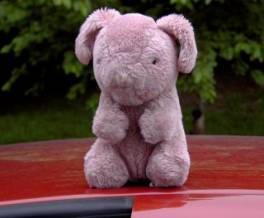
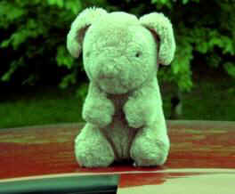
pre-calibration image of the resident Furry Pig is quite simply … all wrong. It is too green.
The post calibrated image is pretty much where the image should be and yet
the graph doesn’t show this at all. This
is why the calibrated grayscale graph that we see in magazines have the potential to also
be terribly misleading. Good data presented
the wrong way can lead to unfortunate and erroneous conclusions.
Of course the fact that I am presenting images on
a web site also introduces a plethora of potential errors.
The irony of this fact did dawn on me.
All images are therefore presented for illustration purposes only. I have to figure that even the poorest tuned
computer monitors out there will at least be able to show the reader that the two images
of the Furry Pig look distinctly different. How
that difference is manifested on the screen, I have no idea.
From the two-dimensional perspective, it is the
same as your thumb being as big as the moon. Now
imagine that you can see 12 inches behind the graph and 12 inches in front of it. The further behind the graph you go, the greener
your image becomes. The further in front you
get, the more red/purple the image becomes. The
green pre-calibration Furry Pig is actually located six inches behind the graph. The post calibration Furry Pig is located on the
graph itself. The idea in calibration is to
get the curve onto the surface of the graph itself too, not in front or in back. This is what D6500K is all about. There are lots of 6500K readings both in front of
the chart as well as behind it. Sometimes,
the curious public loses sight of this and simply gets focused on the magic 6500K number
thinking that it is only the number 6500 that is all important.
Page 1 | Page 2
|